
Choosing the right color palette for your interior is like picking the perfect outfit for your home—it sets the mood, defines the vibe, and can transform even the most boring space into a personal sanctuary.
Whether you’re planning a full-on renovation or just looking to freshen things up, the color combinations you select will play a critical role in the outcome.
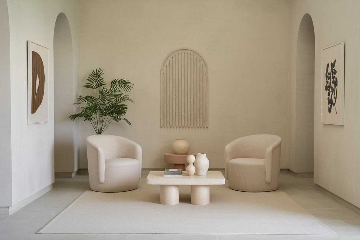
1. Soft White and Sandy Beige
This is the equivalent of a deep breath in your home. It’s calm, it’s minimal, and it never goes out of style. A soft white base with touches of sandy beige feels warm and grounding. Think white walls, beige linen couches, and creamy textiles.
2. Navy and Mustard Gold
Like a tailored blazer with a bold pocket square, this pairing screams confidence. Deep navy walls or furniture with accents of mustard gold brings drama and elegance, while still feeling grounded. It’s perfect for living rooms or bold dining areas.
3. Forest Green and Pale Peach
Forest green brings nature indoors, while pale peach adds softness. This color palette thrives in spaces that aim for a calming yet contemporary feel. I once painted my home office with this combination, and suddenly, Zoom meetings felt less stressful.
4. Charcoal Gray and Burnt Orange
This combo whispers sophistication with a hint of edge. Charcoal gray walls or cabinetry paired with burnt orange pillows or artwork creates an inviting space that’s perfect for lounging or entertaining guests.
5. Dusty Blue and Cream
This pairing evokes a cloudy sky and soft cotton. Dusty blue walls work wonders in bedrooms and bathrooms. Add cream-colored wood trims or soft fabrics, and you’ve got a relaxing, timeless escape.
6. Blush Pink and Olive Green
Don’t dismiss blush pink as too girly—it becomes incredibly chic when paired with earthy olive green. Use this duo in a dining space or reading nook for a subtly romantic atmosphere.
7. Terracotta and Ivory
Terracotta, with its sun-baked Mediterranean feel, combined with ivory creates a warm and welcoming environment. It’s the palette of Italian villas and slow summer afternoons. Great for kitchens or entryways.
8. Black and White with Brass Accents
You can’t beat the classics. Black and white is crisp, modern, and clean. Add brass accents through light fixtures or handles to elevate the look into timeless sophistication. It works especially well in kitchens and bathrooms.
9. Greige and Warm Taupe
When you’re caught between gray and beige, greige steps in as the perfect mediator. Pair it with warm taupe for an inviting neutral palette that doesn’t feel cold or flat.
10. Sage Green and Off-White
Sage green has had a renaissance recently—and for good reason. It’s fresh, serene, and pairs beautifully with off-white tones for a nature-inspired palette. This works wonders in bedrooms, home offices, or bathrooms.
11. Mocha Brown and Creamy Latte
Imagine the color of your morning coffee ritual—that’s exactly what this combo delivers. Mocha brown grounds the space, while creamy latte warms it up. A living room decked out in this palette is hard to leave.
12. Cornflower Blue and Warm White
Cornflower blue has a touch of nostalgia—like your grandmother’s summer kitchen—and when paired with a warm white, it feels both fresh and classic. Try it in kitchens or sunrooms.
13. Rich Plum and Champagne
This luxurious palette is made for drama. Plum walls or furniture add depth and elegance, while champagne accents lighten things up. Think velvet cushions, gold mirrors, and evening dinner parties.
14. Light Gray and Aqua
There’s something coastal and breezy about this combination. Light gray keeps things modern, while aqua injects life. Use this palette in bathrooms or casual sitting rooms.
15. Soft Lavender and Pale Gray
Lavender can be tricky—but paired with a cool pale gray, it becomes serene and surprisingly modern. A great combo for bedrooms, nurseries, or quiet home libraries.
16. Ochre Yellow and Dusty Teal
A palette with personality. Ochre yellow pops against the moody undertones of dusty teal. It reminds me of artisan ceramics—imperfect but beautiful. Use it to create character in kitchens or hallways.
17. Pale Mint and Whitewashed Wood
Light, airy, and just a bit vintage. Pale mint pairs effortlessly with whitewashed woods for a rustic yet clean aesthetic. A delightful choice for Scandinavian-inspired interiors.
18. Deep Red and Soft Gray
Deep red has a bold presence, but when softened with a cool gray, it becomes sophisticated instead of overwhelming. Try this in dining rooms or moody lounges for an upscale feel.
19. Ocean Blue and Soft Sand
This is the palette of beach vacations and daydreams. Ocean blue walls or accents alongside sandy beige flooring or rugs make for a relaxing, coastal-inspired space. Great for bathrooms or sunlit reading corners.
20. Champagne Pink and Pearl White
This subtle and elegant palette gives off a barely-there glam. Champagne pink isn’t overtly pink, and when paired with pearl white, it makes a dreamy bedroom or sophisticated vanity area.
21. Cool Slate and Buttercream
Slate gray brings the modern edge, and buttercream balances it with warmth. This is one of those combinations that works beautifully across seasons and styles, especially in transitional living spaces.
22. Warm Clay and Earthy Brown
This palette brings you back to the earth. Warm clay tones have a grounding effect, especially when paired with deep, earthy browns. Ideal for rustic or southwestern-style interiors.
23. Periwinkle and Bone
There’s something poetic about periwinkle—a cross between lavender and blue—that feels calming and whimsical. Paired with bone white, it creates a delicate balance of color and calm.
24. Pewter and Ice Blue
Pewter gray, with its subtle metallic edge, paired with ice blue, creates a cool, modern vibe. I used this in a guest bathroom, and suddenly it looked like something out of a luxury hotel catalog.
25. Moss Green and Weathered Wood
This pairing feels like a forest cabin retreat. Moss green walls with weathered wooden elements feel organic and soothing. Ideal for reading nooks, mudrooms, or rustic kitchens.
26. Goldenrod and Stormy Gray
A bold choice, but when done right, goldenrod yellow becomes radiant against a stormy gray backdrop. It’s an energetic and dynamic pairing, perfect for creative spaces like studios or home offices.
27. Arctic White and Navy Ink
Arctic white feels modern and fresh, while navy ink adds seriousness and maturity. This is the color palette of high-end New York apartments—timeless, structured, and elegant.
28. Lilac Gray and Soft Coral
Lilac gray is one of those modern chameleon colors that change with light. Pair it with soft coral to inject life into otherwise muted tones. Great for adding a playful touch to formal areas.
29. Cocoa and Muted Pink
Rounding off the list, this combo is unexpectedly cozy. Cocoa browns lend richness, while muted pinks soften the look. It’s like your favorite chocolate dessert with a rose on the side—comforting yet beautiful.
Conclusion
Choosing the right interior color palette isn’t just about matching shades—it’s about reflecting who you are, how you live, and the energy you want to bring into a space. Don’t get lost in endless Pinterest scrolling. Instead, identify the mood you want to create and pick a palette that supports it.
When in doubt, start with a neutral base—think whites, grays, or taupes—and then build in accent colors that express personality. Textures and lighting also affect how colors show up, so always test swatches on walls and observe them throughout the day.
Designing your home is like writing your own story—every room, every corner speaks something about you. These 29 color palettes aren’t just combinations; they’re characters waiting to come alive on your walls, furniture, and décor.
Leave a Reply